Welcome to part two of the Piecemeal Quilts/Grey Cat Quilts Skill Builder Series. Be sure to check out Jeanne’s post on this subject as well. We’ve decided to break this into two posts from each of us. Today we’ll post about overall fabric selection (as in, what should I buy for my stash?) and tomorrow or Tuesday we’ll follow with posts about putting fabrics together in a project. Because color and fabric preferences are so subjective, we’ll offer different perspectives. Keep in mind, though, that this is still just two opinions, and there are many, many other ways to look at fabric selection. The information below applies to all fabrics, whether you like traditional or modern. Try not to see the fabrics I chose so much as the points I tried to illustrate.
Some quilters prefer to purchase only what they need for a particular project, and there are definite advantages to that, not the least of which is financial! If you have a limited budget and a limited space, this is definitely the way to go. Other quilters like to purchase fabrics that attract them when they see them, regardless if they have a project in mind. When they do choose a project, they’ll “shop” from their fabric stash. (Or, like many of us, you may buy a whole bunch of fabric for you stash, and then buy more for a project!) If you choose to stash, don’t be like me! I have an enormous stash (this is about 2/3 of the quilting fabric):
While it is nice to have such a large stash to work from, it also means that I spent a lot of money on fabric that I may never use. My tastes have changed over the years, and I also purchased a lot of fabrics that, while I still like them, don’t lend themselves to the kind of quilts I want to make. While I love all of the fabric I have, I sometimes wish I had planned my stash better.
There are five things I consider when looking at fabric: Color, Value, Print, Scale and Quality.
Color
Many of us gravitate toward certain colors, as you can see from my stash above. I have a lot of reds, blues and greens, not so many yellows, oranges or purples. I lean toward clear colors as opposed to grayed or aged colors, but I have a few of them, too. It’s always more fun to work with colors that appeal to us. Don’t be afraid to add a few fabrics that you aren’t sure you like, though. Sometimes those fabrics that make you squinch your face up a little are exactly what a quilt needs to give it some life.
Remember, when you’re picking fabrics to make a quilt, it isn’t the same as choosing clothing – you don’t have to look good in it. For example, I love this yellow-green sulphur color…
…but there is no way I could ever wear it. I’d look like I was about to vomit. But a little bit added to other colors in a quilt can add interest, as with this purple and aqua combination.
Scattering “odd” fabrics around a quilt helps keep the eye moving, which is a good thing. Odd doesn’t just have to be about color – it is often defined by value, and sometimes by print or scale.
Value
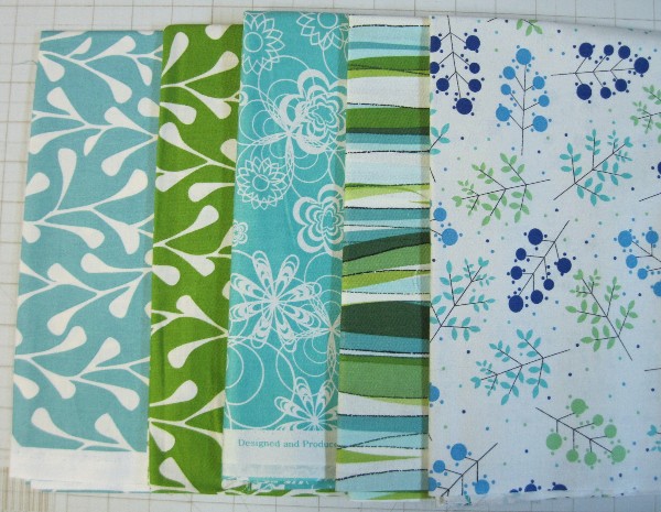
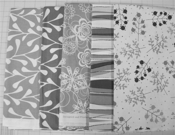
Value is the lightness and darkness of a fabric. When you’re working on a project, different values add “sparkle” to the quilt. The medium value fabrics tend to be more attractive when you’re buying fabric. I really have to push myself to buy lights and darks. They’re boring on the bolt, and I don’t want to think about them because I like pretty fabrics. I have to remind myself that I’m not buying fabric to hang on a wall, I’m buying it to put in a quilt. Value is so much more important than we give it credit for. In fact, I’ve often thought about rearranging my stash so it is sorted primarily by value, then by color.
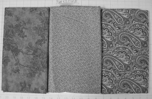
Value can be difficult to see when you’re comparing two different color fabrics. You can buy red and green transparent plastic tools that help you see the relative value, but you can also use a digital camera that has a black and white setting, by editing a digital photo to black and white, or by printing a photo in black and white.
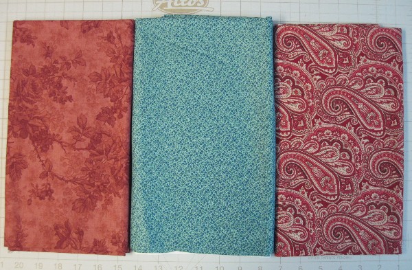
Looking at this group of fabrics, you might think you have variation in values. The aqua is obviously very different from the two reds.
But when you remove the color and look at just the values, they’re very similar.
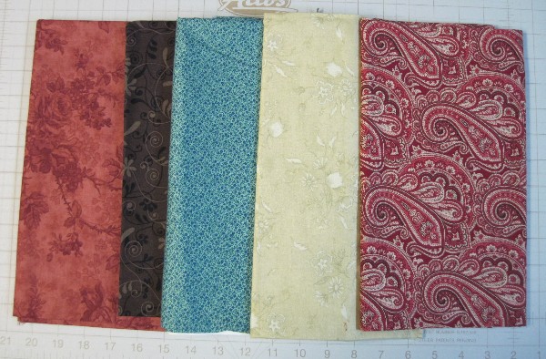
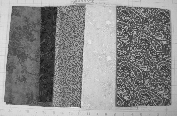
Try adding something very dark or very light to broaden the values.
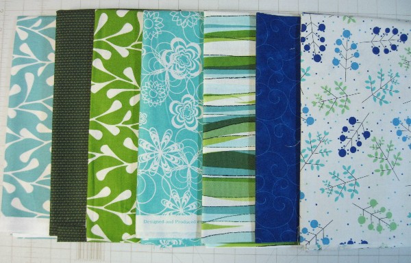
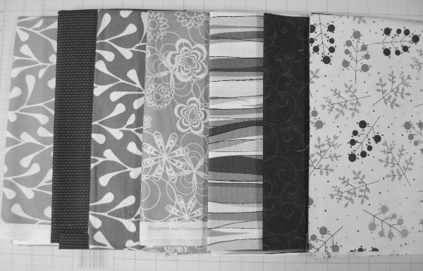
Here are a few more examples:
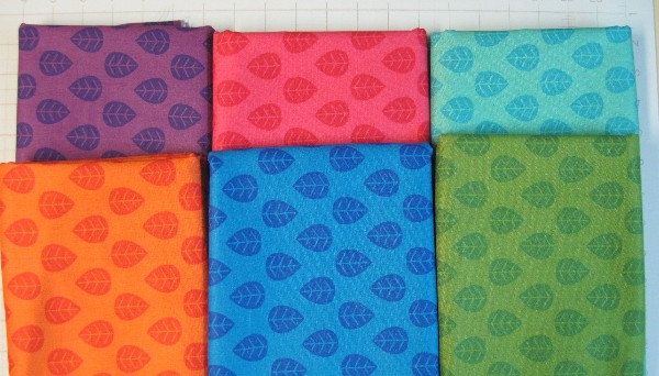
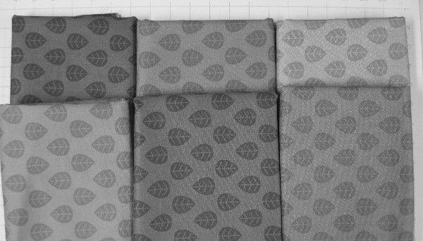
For this final group, you’d expect that their brightness and concentration of color would be enough, but even very bright fabrics, if they are similar in value, can seem to blend together to the eye.
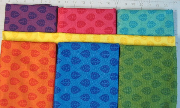
Although there is a little variation in the values, you basically have three mediums, two slightly darker and one slightly lighter. With a little bit of yellow thrown in…
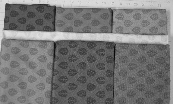
… you can see a marked difference in the value of the yellow compared to the others. Here’s an EQ7 illustration of a quilt using similar colors, first without the yellow:
As you can see, the orange helps, even viewed in black and white. However, when you add the yellow, the quilt seems a little more vibrant and lively. Your eye skips around the quilt from yellow to yellow.
And the black and white version makes it even more evident:
Look at the two side by side:
The one on the left, while bright, also appears just a little flat, while the one on the right sparkles a little. (I’m having a little trouble finding the right word to describe the effect, so I apologize for all of the “sparkles” and “zings” and such.)
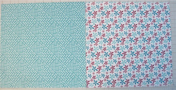
Print isn’t just solids vs. prints. It’s also how you see the fabric from a distance. From 10 feet away, does the print fabric look like a solid or slightly textured single color, or is there a distinct multi-colored pattern to it?
While both of these fabrics are prints, the one on the left, from a distance, would look blue, while the one the right will still look like a print.
One of the survey questions was about fabric choices. The category with the most votes so far is solids and near solids such as shot cotton – about 67% of responders checked that box. The second most popular category, with 65%, is tone on tone fabrics (also referred to as “read as solids”). The advantage to these two categories is that they convey a color rather than a shape or print. This allows your quilt design to show through. As you work with more complex designs or smaller pieces, there’s a real advantage to fabrics that are a single color when viewed from a short distance. The problem is, solids and tone on tone fabrics aren’t as fun to buy. I mean, when you have a choice between a beautiful print and a piece of blue fabric, you naturally gravitate toward the print. They can be more limiting in your quilt, however. I have a lot of multi-color prints in my stash, and I wish I had more tone on tone fabrics.
Think about how directional fabrics will work in your projects before you buy them. Stripes are great fun as binding, especially when you cut your binding strips on the bias. They can be a pain if you’re making half square triangles, however. The stripes don’t always go in the same direction, which bothers some people.
Scale
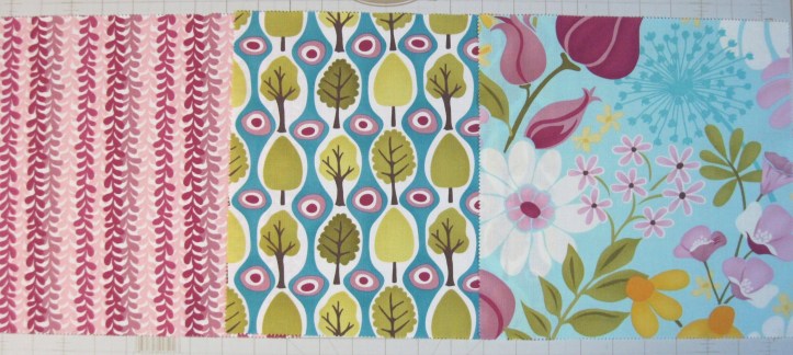
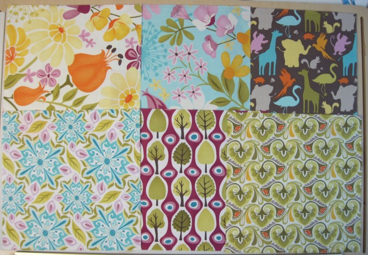
Scale is the size of the print (you should also consider how closely it repeats). Here are fabrics in three different scales.
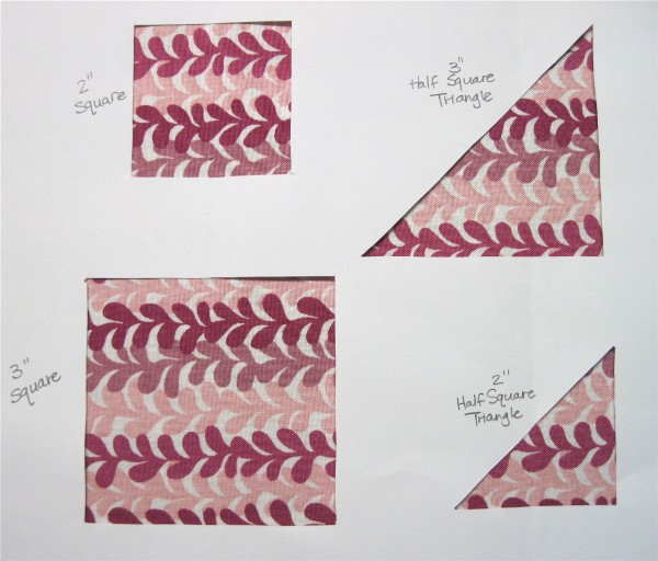
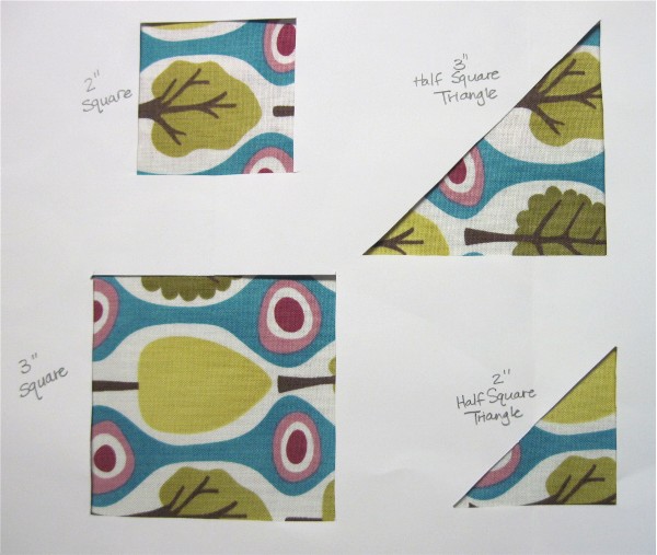
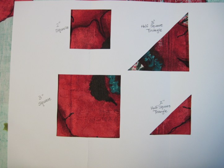
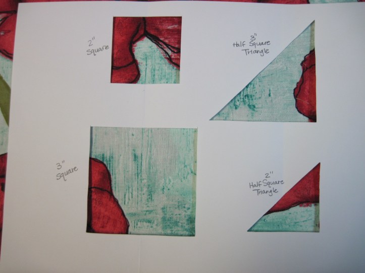
When you shop, try to keep in mind that you’ll be cutting the fabric into smaller pieces. Think about how they’ll work in a quilt. I like to block off a small area of the fabric with my hands to see what a 2″ square might look like. You can also take along a piece of paper with shapes cut out of it in the size of finished fabric pieces.
Generally speaking, larger scale prints look best if they’re cut in larger pieces. This is not a hard and fast rule, however. If you look at the pinwheels I did in the first Skill Builder post, I used a larger scale print as the background fabric.
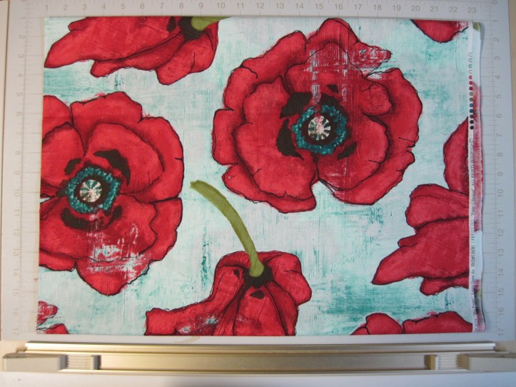
Although very large scale prints can be gorgeous, you may find them difficult to work with in a pieced quilt. For example, I absolute adore this fabric.
However, I haven’t a clue how to use it in a pieced quilt. The print is so large that if I tried to use in 2″ or 3″ squares or HSTs, I’d lose the print entirely.
Even 10″ squares or a wide border would lose a lot of the charm of the print. I’ll eventually use it in a quilt back, where I can feature it in a single large piece.
Quality
I always suggest buying the best quality fabric that you can afford. That means different things to different people, and I recognize that the economy being the way it is certainly affects our decisions. I’ve found that JoAnn’s is pricing many of their quilting fabrics in the same ballpark or even higher than my local quilt shops. Of course, they regularly discount it as much as 30%. On the other hand, check the clearance shelves of your local quilt shop. It might mean choosing a fabric that isn’t “perfect” but that can be a good thing if it pushes you to work outside your comfort zone. Online fabric stores also regularly have clearance fabrics for prices that are easily in line with chain stores. I picked up some amazing “seconds” at Connecting Threads for less than $2.50 a yard (the bright leaf prints in the photos above), and I frankly can’t see what’s wrong with them.
I admit, I prefer quilt shop quality fabrics. I trust it not to shrink excessively, not to bleed, and not to wear too quickly. Notice, though, that I said quilt shop “quality” fabrics. That doesn’t mean I buy exclusively name brands. I’ve found a few winners at Hobby Lobby and even JoAnn’s. The green and blue prints above are from JoAnn’s, for example. (Although I’m peeved at my local store for sticking the quilting cottons in a corner behind shelves without enough room for two carts to pass. But I digress.) My decision is based on three things – clarity, texture and weight. If the printing is sloppy so the colors overlap and create a muddy look, I won’t buy it no matter how inexpensive it is, because I think it looks cheap. The texture must be smooth and fine, and it must have a substantial weight, not feel flimsy or coarse. If I can see through it, I don’t buy it. This is based on regular quilting cotton fabrics, of course. There are a number of lighter weight fabrics that are becoming quite popular. I haven’t worked with them, so I can’t give an opinion.
Several people responding to the survey reminded me that thrifted fabric is experiencing a resurgence. I’ve seen some beautiful quilts made from vintage sheets, and nothing will match the sentimental value of a quilt made from outgrown or worn out clothes. They’ve also reminded me that cotton is not the only fabric used on quilts. Try other fabrics, but be aware that different types of fabric have different wash and wear properties. Finally, don’t be afraid to create your own fabric with dyes and discharges.
Precuts
The biggest advantage to precuts, in my mind, is that you can get a lot of different fabrics for a relatively small price. How fun to be able to play with the entire line of a favorite designer!
Another advantage is that they can reduce cutting time. There are a lot of books and patterns that are geared toward precuts, and many fabric companies are encouraging individuals to share their quilt designs based on precuts. When a pattern uses 2 1/2″ strips, having a roll on hand is certainly easier than cutting 40 strips yourself.
There are some definite disadvantages, however. When you figure the price per yard, precuts are often about 25% more expensive than yardage.
Also, fabric lines often have a lot of multicolor, medium to large scale prints, and as noted above, they work together differently than solid and tone on tone fabrics or even smaller scale prints. They can get very busy if you put them all together. That may be the look you’re going for, of course.
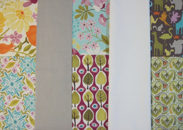
Many quilters choose to add solid fabric to break up the large chunks of prints. Right now, white is very popular, as are both light and dark gray. Black can also set off vibrant colors.
Consider other solids, though. Pull colors from the print and find matching solids. Some fabric companies are even producing their own range of solids to match certain lines. You can take it a step further and use a solid that is similar to the colors in the fabric line, but not exactly the same. It gives a bolder, more creative look because it doesn’t blend across the quilt.
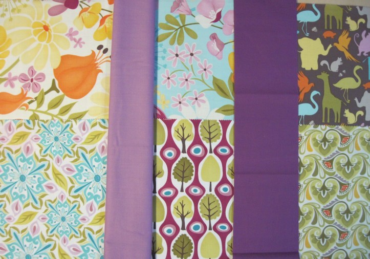
Precuts can also encourage you to work strictly within a single line, which sometimes leads to a formulaic looking quilt. Don’t get me wrong – I’ve made them, and I’ll make more! Instead of sticking solely to the precuts, though, consider combining precuts with other fabrics outside the line. As I mentioned above, combining fabrics that do not quite match adds a little zing that can change a quilt from pretty to magical.
You can see that the purple and the orange don’t quite match the colors in the prints, but they are bright, clear colors with similar intensity.
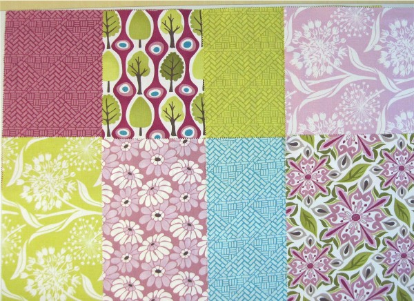
If you enjoy working within a single line, try using yardage instead of precuts. Pick a limited number of fabrics, and try some less “wow” prints. Many lines come in several different colorways, and you don’t have to include every color in your quilt. See how this selection of fabrics has a less frenetic feel than the first photo, which had a lot of large scale prints?
Quantity
There is no easy answer to the question of how much fabric to buy. It really depends on the quilter. As a general rule, the greater the variety of fabrics you like to put in a single quilt, the smaller your yardage purchases can be. Quilters who like very scrappy projects can make incredible quilts with only fat quarters. If you like a very planned quilt with just four or five fabrics, you need to buy much larger pieces. I tend to purchase a yard or two at a time. If it’s a tone on tone fabric, I buy larger pieces because I know I can use it more easily. If it’s a larger scale print, I get 1 1/2 – 2 yards because I know I’ll probably only use it for a border. Medium scale prints and novelty prints are usually 1/2 yard to 1 yard unless they’re on clearance. Light and dark tone on tones are stockpile fabrics for me – I buy three or four yards, and the same is true for solids. If you happen upon good quality clearance fabrics that are marked way, way down, buy them in large quantities, even if they’re not quite your thing – they make great backs.
There are so many fabric options out there it can get overwhelming. You don’t have to have a project in mind when you purchase fabric, but you should try to keep in mind what kind of projects you plan to work on and try to focus on fabrics that are suitable. Try not to let the pretty ones carry you away – the workhorses are just as important.
Come back on Monday or Tuesday for the second part of the fabric selection post. That one will focus on choosing fabrics for a project, and I’ll extend some of the examples I showed above into quilt block and top illustrations.
If you’ve made it this far, are there any tips you’d like to share? Any questions that I didn’t answer? Let me know!
Be sure to read the second half of the PM/GC Quilts Skill Builder Series: Part 2B – Fabric for information about putting fabrics together in a project.




Color always seems to be a sticking point, no matter what the experience level of the quilter. You are so right that it is extremely subjective. As dull as it may seem to take black and white pictures of such pretty fabrics, value is key for making a quilt exciting.
Ages ago I had the privilege of taking a color class taught by Jinny Beyer, where we spent half the day pulling colors for quilts – ten to twenty or more per quilt! the one comment that has stayed with me for years is that in a quilt, you need at least one “deep dark” – a very, very dark colored fabric – and a very very light one. They give the quilt movement and keep the other gorgeous fabrics you pick from just sitting there.
Wonderful post. Great examples and pictures.
A very informative and helpful posting. I love color but sometimes have a hard time making it work in a quilt.
Thanks for doing this series.
This was a really terrific post. Value is so important and definitely takes a quilt from fine to fantastic! I also have to make myself buy lights–I’m always cruising the clearance bins or remnants since I do love the scrappy look. Scale is right up there as well–nothing muddies a quilt more than a bunch of fabrics all the same size print! A hint I would suggest regarding buying from designer lines (or coordinates of any kind) is to get 1/3-1/2 yard cuts when purchasing for a specific block/quilt pattern. Gives you lots more options and leftovers to add to a pieced back or your scrap bins.
Thank you for this post! I’ve read so many articles about choosing fabrics that it makes my head spin and makes me nervous! You took it step by step and I loved all your examples! I’m an intermediate quilter and I’ve learned a lot with this post. I’m off to read the companion piece at Grey Cat Quilts!
Thanks for the great post. I especially liked the segment on value. I’m having trouble with fabric selection on a quilt right now and had taken black and white photos for comparison. And I still wasn’t sure. Now that I’ve seen your black and whites I better understand what I should be looking for. 🙂
You did an excellent job of explaining value- it is really easy to get caught having all medium value and getting a muddy look to the quilt. A quilt needs the contrast to make it work and your photos really show the importance of that.
Thanks for sharing. Regards,
Anna
I can’t believe you outdid yourself – your first tute was one of the best I’ve ever seen and this one is even more outstanding!
For what it’s worth, I can’t pick nice fabrics. I let others do it for me. What I pick, I love, and everyone else gags. Hehehehe. Just another “fabric selecting” technique for everyone 🙂
Thank you so much for outlining color and fabric buying rules in a non text book fashion. Your explanation of how and why of color makes more sense than any information I’ve read in my quilt books and magazines. Thank you so much for turning on the light!
Great tip on using the digital camera, too! I have so much trouble with those little narrow strips of red and green plastic.:)
As a novice quilter, I want to thank you for your well-written and informative post.
Very informative post. I just found your site and will have to spend some time catching up. I appreciate what you are doing here.
Hello. I’m beginner of Machine quilt in Korea, and your posting is very helpful. I want introduce your posing to Korean. Is that Permitted?